Extranet with secure webmail

Extranet with SafeMailSometimes all a complex problem needs is a better metaphor.

This higher-ed consultancy, client of ours, has been struggling for years with transfers of large data files to and from their clients. Statistical analysis works best on large data sets, and in this case, the files reach in the dozens of megs, and they usually are burnt on CDs and sent in the mail.

Some more courageous institutions had been uploading files through a web interface, but that was fraught with problems, mostly with dropped connections and uploads. Also, there was a lot of back-and-forth on the phone with clients, trying to determine which uploaded file was which, which was outdated, which had changed.

We had finally come up with a semi-reliable way to allow web upload, and decided to revisit the whole user experience before we implemented it. The developers had a clear vision of an online file manager, but I insisted we look at the actors, context, and goals.

It turns out that these files are always exchanged in the context of customer service, always accompanied with conversation and clarifications. And there is a better metaphor for this kind of file exchange: Email attachments.

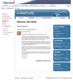
I proposed a prototype of “Safe Mail”, a new set of pages on the extranet where clients can check their mailbox for messages and announcements, send messages with secure multi-meg attachments, and keep track of the entire process. I made sure to include thumbnail photos of the client’s consultants with their email, and to demo an announcement from the big boss, to highlight the customer service, marketing and sales value of this relational tool. 

The client loved it. The entire office has been abuzz about it since the demo, and the developers are working hard to make it real. It’s going to simplify a whole lot of things around here, and everybody’s very busy trying to find the right photo to use on their profile.

I love it when looking at context and personal goals allows for a complete mind-shift into a better metaphor. We’ve done more than solve an issue here; we’ve changed the nature and tenor of customer service, making it both more rational and more personal.
Hello operator!

Finished another one of my “deus ex machina” one-week fix-it-all stints, this time at the offices of a large cable operator. As usual, this was a SharePoint project, attempting to find some value to deliver to the operations. More specifically, a way to connect the distribution hubs of Video-on-Demand services, with coordinated schedules.

After a half-day being walked through the technical requirements, and attending meetings that were more about politics than tech, I finally asked my team: “Where are the users?”

We descended out of cubicle land and into the depths of Ops, which looked like the interior of the death star. Hallways made of server racks. Finally to a dark room where a few operators sat at a large console, consulting giant screens plastered on the walls, beaming Video-On-Demand by satellite to the four corners of the country. And I spotted the current solution: an excel spreadsheet, prominently displayed on one of the bigger screens, that one of the operators was busy hand-editing.

It turns out, of course, that the users weren’t directly using the current system. They were copy-pasting from it into a master Excel spreadsheet, basically a glorified list. Then, a few times every day, one of them would copy-paste out each hub’s portion of the master sheet, and send each hub their own version of the spreadsheet. It was constant manual labor, yet still outdated every few hours. But it worked better then trying to tease out the relevant info from the cumbersome legacy system.

Once more, a little ethnographic research saved the day. I pointed out the low-tech, instantly usable solution: Import their master spreadsheet into SharePoint. Allow them to mark different rows for different hubs, and have SharePoint automatically replicate this into each hub’s team site. Total time to code and test: 2 days. And the users loved it. We walked back down into the death star, showed it to them, and they had it on the big screen in ten minutes.

The solution was so elegant and simple that I even had time left, the last day of the week, to put together and deliver a little training session at one of the hubs, for the other users of the system. They were shocked and delighted that someone came to see them, with a solution instead of questions, and even more shocked when they realized that I’d just come in out of nowhere and cut their workload down by 20%.

Anytime there’s a SharePoint implementation that has not leveraged any Usability/ User Experience skills, coming in is like shooting fish in a barrel with a bazooka. Too darn easy.

It was a fast-paced week, but the client’s happy, the users are happy, and my boss is happy. I’m going to enjoy the weekend.

Clean and simple…

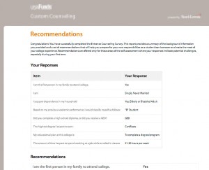
Clean, clear UI for a questionnaire app.Finished building a nice clean UI for a college counseling questionnaire app. This was an exercise in using CSS to deliver a clear design across browsers, including the dreaded IE 6, with only a couple of days to test and deliver.

White space, use of Lucida Sans Unicode on Windows and Lucida Grande on the Mac, and attention to type spacing and layout made this a winner. The client was delighted, and requested no changes.

Another one in the bag. Moving on…

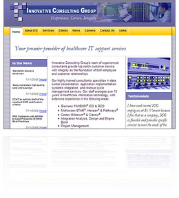
InnovativeCG is live!

Just finished a quick, bare-bones, low-budget redesign and custom content-management system for Innovative Consulting Group. Another fun little project, using simple “good old” ASP and an MS Access back-end. A little bit of database-driven Flash, as well.

I am starting to really enjoy little low-tech projects like this one. The cutting edge is fun, but sometimes it’s so refreshing to go back in time and slip into some old tried-and-true technologies. It’s like a pair of shoes you haven’t worn in a while: Unfamiliar, yet fitted.

I also love the challenge of delivering superior user experience on a shoestring budget. Applying all the lessons I’ve learned without the frills. The client was also a delight to work with. They knew what they wanted, and how to delegate the rest. A good relationship with one’s client is priceless.

Directions and Campus maps for Exempla Healthcare

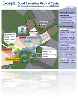
This is an interesting set of Flash movies. The directions to the hospital are animated, and the campus map features zooming in to the different floors.

Not exactly earth-shaking stuff, but I did try to go a bit past the paper metaphor, and exploit some of the capabilities of animated media. A bigger budget could have made it look more slick, but I don’t mind tight deadlines. Obstacles breed creativity.

Clinical Trials and Tribulations

A humanized flow diagramWorked on a whopper of a project, for Microsoft. My company was picked to help develop a “Solution Accelerator” for the Pharmaceuticals industry, providing a SharePoint implementation template for clinical trials, as well as some InfoPath data-gathering tools.

Clinical trials are enormously complex, regulated, and expensive. We focused on the protocol creation and approval process, which contains aspects of collaborative document authoring and workflow, regulatory submission and approval, etc. I had always thought enterprise software projects were big things, but taking a look at clinical trial protocols helped put that in perspective.

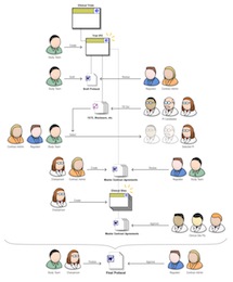
The challenge was to learn a lot very fast, in order to be able to add value. In about five weeks, we nailed down the realities of the process of protocol creation and submission, and I insisted we also focus on the context and goals of the different actors and stakeholders. I designed a nifty cast of characters, which we used in process diagrams to make the workflow come to life. They proved unexpectedly useful.

What happened is that the little sketch you see here helped everybody on the team stay on the same page in terms of user functionality. Developers working on a module could see the gal in the white lab coat and glasses using their module, and they made the interface precise and data-rich. UIs were markedly different, more verbose and action-oriented, for the suit-and-tie users.

I created countless flow diagrams, worked closely with developers to ensure all requirements were covered, and designed the SharePoint UI to host and unify it all. On a project of such scale and urgency, the difficulty was to not let user considerations get buried under the colossal weight of enormous and dense requirements. Tensions ran high, but we delivered, and the client was satisfied with the result.

Depth of Vision: Isometric Flash 3D for Business Visualization

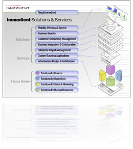
Thumbnail for Depth Of VisionAhem… Sorry about the overly pompous title on this post… “Depth of Vision”, a flash presentation, is a nice little piece I developed, pretty much on my own, to showcase Immedient’s solution offering. Not much budget behind it: The voice-over talent is my wife!

Isometric 3D is that funny look you’ve seen with pixel art. It’s perspective without depth. I’ve always liked the look of it, even though it’s artificial. I think it’s because even though we never see the world without depth, when we conceive 3D objects, our mind’s eye sees them in an isometric mental model…

This fun little project took less than a week to put together, and was finalized and committee-stamped in less than a week after that. Kept me busy between billing gigs. Enjoy!

Colorado Midwives Association is Live!

Spent a couple of days overhauling the Colorado Midwives Association‘s website, for my friend Dana Beardshare. Dana and Jan were our midwives, and the genuine love they poured into caring for my wife and I was an enlightening experience, and a deeply humbling one for me.

Yes, there is room for love in business, and in medecine, but we’ll have to stop and listen to women to learn how. My meager thanks is this little bit of help on their website.

Beyond HTMLeum

Oil Industry UI DesignDid a one-week stint in Houston, Texas for a large international oil company, helping fix an internal accounting app. As is common with enterprise engagements, we were not only putting together a unified dashboard for a set of disparate and incompatible financial and accounting systems, but also walking the slick tightropes of high-flying politics. 

It was a quick intervention in a middle of a dense financial project. I was brought in late (post-requirements phase) but since the project was already starting to unravel, the client was ready for a semi-radical realignments of priorities.

I confined my work mostly to the UI, where I applied a whole heaping load of goal-directed thinking, and reduced the multi-screen app to a single screen with 3 tabs. I also noticed that speed was the big unvoiced issue with the application. Demos and training sessions were tense because of these dead moments of waiting for pages. Since the app was presenting results from batch-processing systems, I made the developer implement a quick and dirty caching system, that made the app nearly instantaneous. I also reorganized all data into a matrix, with a clear action column, as well as visual progress bars. Add to that a nice clean design in company colors, and the next demo was a raging success.

I’ve done my week in Houston, everybody’s happy, I’m going home.