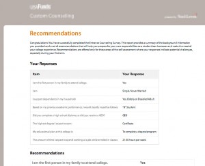
 Finished building a nice clean UI for a college counseling questionnaire app. This was an exercise in using CSS to deliver a clear design across browsers, including the dreaded IE 6, with only a couple of days to test and deliver.
White space, use of Lucida Sans Unicode on Windows and Lucida Grande on the Mac, and attention to type spacing and layout made this a winner. The client was delighted, and requested no changes.
Another one in the bag. Moving on…
