Breaking through at BMGi

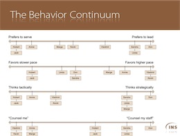
A slide from the BMGi training sessionsDelivered a series of Lovable Sharepoint training sessions for Breakthrough Management Group. BMG is an exciting company, that does what I do: Consult on process. They do it mostly with large industrial clients, where a little process can save a lot of money. I was out training their staff on the user-directed approach to SharePoint. We developed Personas and Goals, explored user-centered information architecture, developed an exquisitely goal-oriented site. 

The message of Lovable SharePoint really hit home at BMGi, where they are acutely aware of the pitfalls of over-engineering. I looked at their resource plan, their scale, and their pressing needs, and basically told them to turn most of SharePoint off, for now. We focused on a high-value, easy-adoption, community-driven approach, and solved some thorny issues with as little new technology as possible.

We had a blast. Over three training sessions, I saw hesitant and overwhelmed team members gain confidence, interest, and more than a glimmer in the eye about the changes we were planning. I left them excited, enthusiastic, and hard at work on this new approach. 

Then I started driving home in the worst snowstorm in over a decade. The one-hour trip from Longmont to Denver turned into eight hours stuck on the freeway. Still, it was a great day!

Default to Worst Practices

I’m currently taking a training class on K2.Net, a .NET-based workflow system. It’s an interesting tool, quite powerful and usable, and the training is also of high quality. Still, it has me shaking my head, because it teaches worst practices.

The lab section of the training has us building a sample workflow, and it is riddled with bad choices. For a start, the approval step in the workflow is captured by an “Approval” variable which is a string, not a boolean. Okay, that’s minor, and I can see that it makes the lab easier. But then other fields are mis-named, or mis-used, as the lab progresses.

Also, the basic form we build to initiate workflow asks the user for a name and email, even though this is an authenticated, registered user, whose name and email we already know from context.What is worst: We later send notifications to the authenticated user, not to the email address they provided in the form.

It’s like death by a thousand cuts. A slow accumulation of slight design errors and inconsistencies, which eventually amount to the wrong way to design a workflow. Okay, I understand that the training is not about workflow best practices… But shouldn’t it be?

The way I see it, this training will result in a dozen people having the ability to use this product, but no idea how to do it right. Builders with a flawed approach to design. And I see the same problem cropping up everywhere. For instance, on a recent article about Atlas (Microsoft’s upcoming implementation of AJAX), a sample showed how to dynamically change the label on a form button to the current time, when the user clicks it. With Atlas, you can do it without a page refresh. Yeah, but WHY? Why would you ever want to put the current date and time on a button label? I know this is a technology demo, but why demonstrate how to do the wrong thing?

This problem is pervasive in developer training, code samples, programming classes. Developers, who often end up having to make design decisions without extensive training in interaction design, get bombarded with examples of bad design. Why do we keep training bad habits into them?

Boot Camping at Baxa

Baxa Website thumbnailConducted, with my friend Peter Alexander, a hardcore two-day Usability, Information Architecture and Design Training session for the marketing team at Baxa. Trying to distill everything in two days is always a high-adrenaline challenge, and I think it went very well. The designers at Baxa are a cool team, eager to learn, and I think they picked up imediately on a lot of what we had to offer. 

We had a good chuckle at some of their product names. They manufacture high-quality, reliable, sterile medical equipment like the “3-way oral port stopcock.” There you go, I’ve said it, and my blog is now on every parental-control blacklist!

For Baxa, I also helped lead a Personas-and-Goals exercise, which helped elucidate a lot of debates and clarify the goals for different sections and tools of the site. I also delivered an information architecture review, and a sitemap.

We’re reviewing their next set of comps, and will help them stay on course with spot-checks. I already like what we’re seeing.