- Coding is suffering.
- Suffering is embodied in the endless wheel of the product life-cycle.
- You cannot escape the wheel of the product life-cycle, because your mind is clouded by desire for a better framework.
- Users cannot escape the wheel of the product life-cycle, because their minds are clouded by desire for features.
- To be free of suffering, one must first understand boolean non-duality: The bit is not one, and the bit is not not-one.
- The spec is forever like sand between your fingers. Yet each grain of it is a precious gift, inviting you to develop compassion for designers and managers.
- Debugging is negative, and unnecessary. Bugs are precious gifts, inviting the QA team and the users to develop compassion for programmers.
- It’s fun to set an array of flags, and let them flap like prayers in the wind.
- If you comment your code, it will bring good karma to you in your next release.
- To reach enlightenment, pipe your mental I/O to /dev/null
Tag Archives: programming
BT DiamondIP is live!
 A whopper of a project!
I was able to set a good direction on the information architecture, and to keep everyone committed to a more-or-less standard navigation scheme. There was little I could do to influence the tone and tenor of the copy, but I did help cut down the marketese to a manageable level. In terms of the visual design and branding, I got to work again with my good friend Peter Alexander, who took in the strict constraints that I was imposing and provided me with just the clean look and photo-graphics I was looking for.
I was committed to building a good modern website, with as little compromise as possible in the quality of the code, design, and trying to stick close to semantic HTML. Noble goals. But I didn’t get a choice in CMS packages. EktronCMS it would be. Ektron is an ASP.NET CMS package with all the features you could want. Smell a rat yet?
It was a constant struggle to get it to work, to get it to work as it should, to get it to work well with clean code. I based the site’s HTML structure on the BluePrint CSS Framework, but that got partially butchered by the junk code ASP.NET wants to inject, and the spaghetti code that Ektron gleefully injects everywhere.
Of course, as a CMS package, Ektron fails as many do: by making GUI editing as complex and counter-intuitive, if not more, than HTML itself. Which means, of course, that the webmaster will have to do the updates anyway… and I could do them faster in Notepad! Also, as a typical ASP.NET application, it breaks all the time. And as a typical enterprise application, it’s also very slow, and ugly as a pig farmer in a cocktail dress.
Nevertheless, I soldiered on through. I used an XML sitemap to drive the navigation dynamically, Ektron collection controls and content placeholders and other god-awful components to put together a site that looks good and doesn’t suck. And custom-coded a bunch of tools and forms. I worked through my Christmas vacation in Paris to get it done. And now it’s done.
I’m proud of the result, yet I can’t say that the process made a lot of sense. I’m an excellent swimmer, but I don’t like to be forced to swim with a backpack full of rocks, especially when nobody needs the rocks or the backpack.
Stratification Tool
 Built a flash-based complex data visualization and stratification tool for a higher education consultancy. The company helps higher ed institutions to recruit and retain students. This tool is aimed at targeting outreach and marketing efforts to the right populations of high-school students, to maximize recruitment success.
In technical terms, it’s a statistical analysis tool. Likelihood to enroll is calculated for a body of applicants, and the tool gives a visual and interactive interface to the process of dividing that body into sub-groups.
This was a dense app, with lots of complex actionscript. I started with the data, building a visual representation that can be rendered as a histogram or smoothed line chart, with arithmetic or logarithmic scale. The user can then add or remove stratification bands, and set the bounds by sliding a knob along the y-axis. Each band reports its totals and percentages in real-time as the bounds are slid around, allowing the user to quickly create a 50-student band, or a band of 50 likely-to-enroll students.
My main goal was to take a complex decision-making process and make as much of it as possible as intuitive and tactile as possible. I did leverage some of the built-in actionscript animation libraries, using them sparsely and quickly to indicate pliancy of the UI, and give an overall feeling of responsiveness.
This was the most technically dense and complex Flash project I’ve done to date, involving XML/SOAP, handmade graphing routines, GUI design and lots and lots of math. I enjoyed it immensely.
Extranet with secure webmail
 Sometimes all a complex problem needs is a better metaphor.
This higher-ed consultancy, client of ours, has been struggling for years with transfers of large data files to and from their clients. Statistical analysis works best on large data sets, and in this case, the files reach in the dozens of megs, and they usually are burnt on CDs and sent in the mail.
Some more courageous institutions had been uploading files through a web interface, but that was fraught with problems, mostly with dropped connections and uploads. Also, there was a lot of back-and-forth on the phone with clients, trying to determine which uploaded file was which, which was outdated, which had changed.
We had finally come up with a semi-reliable way to allow web upload, and decided to revisit the whole user experience before we implemented it. The developers had a clear vision of an online file manager, but I insisted we look at the actors, context, and goals.
It turns out that these files are always exchanged in the context of customer service, always accompanied with conversation and clarifications. And there is a better metaphor for this kind of file exchange: Email attachments.
I proposed a prototype of “Safe Mail”, a new set of pages on the extranet where clients can check their mailbox for messages and announcements, send messages with secure multi-meg attachments, and keep track of the entire process. I made sure to include thumbnail photos of the client’s consultants with their email, and to demo an announcement from the big boss, to highlight the customer service, marketing and sales value of this relational tool.
The client loved it. The entire office has been abuzz about it since the demo, and the developers are working hard to make it real. It’s going to simplify a whole lot of things around here, and everybody’s very busy trying to find the right photo to use on their profile.
I love it when looking at context and personal goals allows for a complete mind-shift into a better metaphor. We’ve done more than solve an issue here; we’ve changed the nature and tenor of customer service, making it both more rational and more personal.
InnovativeCG is live!
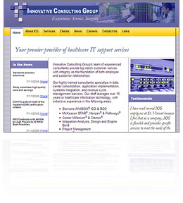 Just finished a quick, bare-bones, low-budget redesign and custom content-management system for Innovative Consulting Group. Another fun little project, using simple “good old” ASP and an MS Access back-end. A little bit of database-driven Flash, as well.
I am starting to really enjoy little low-tech projects like this one. The cutting edge is fun, but sometimes it’s so refreshing to go back in time and slip into some old tried-and-true technologies. It’s like a pair of shoes you haven’t worn in a while: Unfamiliar, yet fitted.
I also love the challenge of delivering superior user experience on a shoestring budget. Applying all the lessons I’ve learned without the frills. The client was also a delight to work with. They knew what they wanted, and how to delegate the rest. A good relationship with one’s client is priceless.
Beyond HTMLeum
 Did a one-week stint in Houston, Texas for a large international oil company, helping fix an internal accounting app. As is common with enterprise engagements, we were not only putting together a unified dashboard for a set of disparate and incompatible financial and accounting systems, but also walking the slick tightropes of high-flying politics.
It was a quick intervention in a middle of a dense financial project. I was brought in late (post-requirements phase) but since the project was already starting to unravel, the client was ready for a semi-radical realignments of priorities.
I confined my work mostly to the UI, where I applied a whole heaping load of goal-directed thinking, and reduced the multi-screen app to a single screen with 3 tabs. I also noticed that speed was the big unvoiced issue with the application. Demos and training sessions were tense because of these dead moments of waiting for pages. Since the app was presenting results from batch-processing systems, I made the developer implement a quick and dirty caching system, that made the app nearly instantaneous. I also reorganized all data into a matrix, with a clear action column, as well as visual progress bars. Add to that a nice clean design in company colors, and the next demo was a raging success.
I’ve done my week in Houston, everybody’s happy, I’m going home.