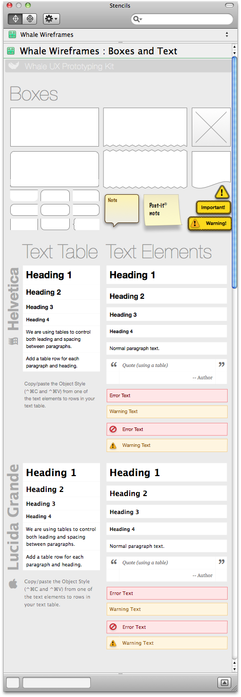
I offer for your consideration this wireframe stencil for OmniGraffle Professional. I’ve been using it and finding it useful for the last few months. Download it here:
Whale Wireframes.gstencil (881Kb .zip)


I offer for your consideration this wireframe stencil for OmniGraffle Professional. I’ve been using it and finding it useful for the last few months. Download it here:
Compassion is quite the eye-opener.
There is often bitterness in software development. It is not hard to see the tense relationships between developers and marketing, between users and customer support, between business and IT. When I entered the UX field nine years ago, I put myself in the interesting and strange position of being the intermediary, the emissary, in a protracted cold war.
By itself, UX is hard. There are many threads woven into the fabric of what we call User Experience. Information Architecture, derived from library sciences; Usability Engineering, which comes from the archetypal white-lab-coat scientific approach; Interaction Design, which borrows from anthropology; and Graphic Design, with its vibrant connection to culture and creativity. And the merging of these approaches brings with it some discomfort, as practitioners try to embrace tools and techniques from disciplines that have very different origins, and sometimes conflicting worldview.
Allright, I’m going to give in to the craziness and put out my own prediction for the Jesus Tablet that Steve Jobs is about to unleash. While everybody’s speculating about the hardware and price (as if this were PC-land, where such things matter), or about the deals with major publishers and the kindle-killing potential, I’m not hearing much about the software. And the software is what matters.
Let’s not forget that Apple makes great hardware because they’re passionate about software. Multitouch was a success on the iPhone for the never-discussed reason that Apple perfected the software layer, the one that converts the shaky, jerky motion of my fat fingers into smooth swipes and pinches. The software that ignores accidental taps, that leverages a rich language dictionary to decide which character I most probably wanted to type, when I mashed the side of my thumb over a large portion of the keyboard. These software interface layers are not trivial work. The fact that everybody took them immediately for granted is a credit to Apple’s user experience designers, as good UX should be invisible.
Apple gets the hardware/software melding right, because they care about creating the ideal experience. Apple wasn’t first to market with an MP3 player, or with an internet-connected smartphone… but once they entered the market, they reset the standard. Apple is not first to market with a tablet computer or an e-reader. But PC tablet and netbook manufacturers are waiting for the shoe to drop. Amazon’s Kindle and Wacom’s Cintiq’s days are most likely numbered. Apple is going to get it right, where everyone has gotten it wrong.
Among the rumors that are flying around, one caught my eye particularly. Apple is working on a multi-touch version of iWork, their office software. This is important. Apple is making deals with news and book publishers to provide them with a platform that enables high production values. Magazines will look good on the iPad. It will usher a new era of publishing, a new target format, that will rapidly take over the web and more. This is music to publisher’s ears, as high production values will again justify high margins.
But Apple will also raise the bar for everyone. Because the reason Apple is passionate about software, is because Apple is passionate about changing the world. They’ve raised the bar in the mobile app space, by providing a superior platform and toolkit, removing the need for developers to worry about the business of sales, and enforcing quality and user experience requirements. They’re going to raise the bar in publishing, but also in business documents, emails, and all forms of the printed word, and of multimedia publishing, by making some cloud-based, multi-touch version of iWork the superior platform and toolkit, as well as the sales and distribution channel… and a large segment of that will be free.
This won’t just be an e-book reader. This may also be the new printing press. EAVB_VFDMVVKEXU
 Rocket surgery has nothing on immunobiology and proteomics. With over 100,000 products, in a dozen categories, and the most complex set of product attributes and filters I’ve ever had the honor of untangling, the Novus Biological website was a textbook case of Information Architecture challenges. Working for SpireMedia, I took on the task of understanding the incredibly intricate world of antibodies.
It was a long and hard slog, yet we got through the information architecture and wireframes mostly on budget and on time. Beyond organizing and laying out the site, I also helped resolve some thorny data issues, such as how to apply cumulative filters on a dozen variables to a list of 50,000 items. I also helped evaluate, spec and implement the Novus Explorer, a Flash-based relationship browser, which for the first time gives researchers a visual, interactive way to explore the connections between antibodies, proteins, diseases and genes, clicking through to extensive scientific litterature. I dare say that, for a site with a tenth the budget of its main competitor, the new novusbio.com raises the bar.
On a personal note, I also had the pleasure of working again with Scott Osgood, an old friend, colleague and client from my Immedient/INS days, who took on the job of CTO for Novus on the same day that I took on the Information Architecture tasks for Spiremedia. A very happy coincidence indeed!
I’m more than a little proud of the work that went into this site, though of course the real credit goes to the amazing design and Drupal development teams at Spiremedia, who burned even more midnight oil than I did.
Picture this: Mobile phones with cameras serving as the public eye.
Visualize free and abundant bandwidth and storage, allowing most camera phones to be constantly turned on, recording whatever surrounds them. Uploading it to a large scale distributed database of images. This database constantly churns the flow of images, matching their features, averaging out the momentary (people, cars) and retaining the permanent (structures). You can explore any place in the world where someone has carried a cell phone, and get a sense of the place.
These cell phones can also record audio, which can be processed to produce the basic “sound” of a place. By using judicious criteria to filter out some unique sounds and retain some more common ones, this “sound” can be more than white noise. Different sound signatures can also be achieved for different times of the day, different seasons of the year. So you can log in, and visit a mountain river, and see how it looked last winter, frozen under a quiet blanket of snow. Then look at it this spring, rushing and rumbling.
You’ll definitely be able to see the tower of Pisa in great detail, inside and out, at all times of the year. There will be no lack of pictures and sounds for that one. The soundtrack will probably retain a lot of crying babies, tour guides, and crowd noises, so I recommend pulling the clock back to the early morning.
Had a good day. I delivered a presentation to a new client in Colorado Springs, and I’m pretty sure I blew their minds.
 It’s all pretty hush-hush, but this is basically an old media company trying to break into a lucrative new growth market through the web… and I was brought in to assess their efforts.
I walked in with my 30-minute presentation, and was told the President could give me 10 minutes. So I crammed through, with more passion and less detail, and he stayed in the room for 20 minutes. Then he left, and I re-started the presentation for the executive who was the intended audience, and who had come in late. Ten minutes later, the president re-enters, along with his Senior Marketing VP, his Senior VP of Ops, and a couple of others. I felt quite vindicated!
A passionate discussion ensued. Clearly some people there were ready for change, and emboldened by my talk. Clearly the President was enjoying this.
I look forward to going back in there and stirring things up some more!
 A whopper of a project!
I was able to set a good direction on the information architecture, and to keep everyone committed to a more-or-less standard navigation scheme. There was little I could do to influence the tone and tenor of the copy, but I did help cut down the marketese to a manageable level. In terms of the visual design and branding, I got to work again with my good friend Peter Alexander, who took in the strict constraints that I was imposing and provided me with just the clean look and photo-graphics I was looking for.
I was committed to building a good modern website, with as little compromise as possible in the quality of the code, design, and trying to stick close to semantic HTML. Noble goals. But I didn’t get a choice in CMS packages. EktronCMS it would be. Ektron is an ASP.NET CMS package with all the features you could want. Smell a rat yet?
It was a constant struggle to get it to work, to get it to work as it should, to get it to work well with clean code. I based the site’s HTML structure on the BluePrint CSS Framework, but that got partially butchered by the junk code ASP.NET wants to inject, and the spaghetti code that Ektron gleefully injects everywhere.
Of course, as a CMS package, Ektron fails as many do: by making GUI editing as complex and counter-intuitive, if not more, than HTML itself. Which means, of course, that the webmaster will have to do the updates anyway… and I could do them faster in Notepad! Also, as a typical ASP.NET application, it breaks all the time. And as a typical enterprise application, it’s also very slow, and ugly as a pig farmer in a cocktail dress.
Nevertheless, I soldiered on through. I used an XML sitemap to drive the navigation dynamically, Ektron collection controls and content placeholders and other god-awful components to put together a site that looks good and doesn’t suck. And custom-coded a bunch of tools and forms. I worked through my Christmas vacation in Paris to get it done. And now it’s done.
I’m proud of the result, yet I can’t say that the process made a lot of sense. I’m an excellent swimmer, but I don’t like to be forced to swim with a backpack full of rocks, especially when nobody needs the rocks or the backpack.
 Built a flash-based complex data visualization and stratification tool for a higher education consultancy. The company helps higher ed institutions to recruit and retain students. This tool is aimed at targeting outreach and marketing efforts to the right populations of high-school students, to maximize recruitment success.
In technical terms, it’s a statistical analysis tool. Likelihood to enroll is calculated for a body of applicants, and the tool gives a visual and interactive interface to the process of dividing that body into sub-groups.
This was a dense app, with lots of complex actionscript. I started with the data, building a visual representation that can be rendered as a histogram or smoothed line chart, with arithmetic or logarithmic scale. The user can then add or remove stratification bands, and set the bounds by sliding a knob along the y-axis. Each band reports its totals and percentages in real-time as the bounds are slid around, allowing the user to quickly create a 50-student band, or a band of 50 likely-to-enroll students.
My main goal was to take a complex decision-making process and make as much of it as possible as intuitive and tactile as possible. I did leverage some of the built-in actionscript animation libraries, using them sparsely and quickly to indicate pliancy of the UI, and give an overall feeling of responsiveness.
This was the most technically dense and complex Flash project I’ve done to date, involving XML/SOAP, handmade graphing routines, GUI design and lots and lots of math. I enjoyed it immensely.
 Delivered a series of Lovable Sharepoint training sessions for Breakthrough Management Group. BMG is an exciting company, that does what I do: Consult on process. They do it mostly with large industrial clients, where a little process can save a lot of money. I was out training their staff on the user-directed approach to SharePoint. We developed Personas and Goals, explored user-centered information architecture, developed an exquisitely goal-oriented site.
The message of Lovable SharePoint really hit home at BMGi, where they are acutely aware of the pitfalls of over-engineering. I looked at their resource plan, their scale, and their pressing needs, and basically told them to turn most of SharePoint off, for now. We focused on a high-value, easy-adoption, community-driven approach, and solved some thorny issues with as little new technology as possible.
We had a blast. Over three training sessions, I saw hesitant and overwhelmed team members gain confidence, interest, and more than a glimmer in the eye about the changes we were planning. I left them excited, enthusiastic, and hard at work on this new approach.
Then I started driving home in the worst snowstorm in over a decade. The one-hour trip from Longmont to Denver turned into eight hours stuck on the freeway. Still, it was a great day!
 Well, I’m down in San Francisco for the Microsoft Expression Launch, and I’m intrigued. Not so much by Expression, which is promising, but not yet a slam-dunk, but mostly by the trend that’s developing in Redmond. Microsoft looks like it might be ready to get design.
Now, don’t get me wrong: We’re not there yet. At this point, there’s a lot of schizophrenia in the air. The speakers sound like Microsofties, geeky and technology-focused, but occasionally they say things that were obviously put in their mouths by designers. It’s tentative, it’s hesitant, it’s uncomfortable. I feel for these poor guys, trying to be loyal to the big Redmond machine and creative at the same time, which sounds like an oxymoron. I know their pain first-hand: I’ve been a UX guy in a geek company for five years, and it’s hard to be true to a user-centered philosophy without spitting in the soup. Same for them: They have to skirt the current reality (which is that Microsoft sucks at design) and it’s nerve-wracking. Kind of like being the Chinese minister for human rights, or an EPA official working for the Bush administration. You mean well, but it’s still doubtful that your boss is really committed.
Nonetheless, this is worlds away from what we’re used to seeing from Microsoft. Clearly, there are people there who go get it, and who are trying hard to get the point across. And the exciting part is that if they succeed, they could change the face of the Redmond Machine. I hope the old Microsoft realizes, soon, that It will take more than words, more than pretty graphics, to really get it. It will take a radical change in thinking, a major transformation. And Microsoft’s developer communities, its business and enterprise customer base, and its very own engineers, will likely all have to be brought into the change kicking and screaming.
But UX is the name of the game today. What tech can do doesn’t get anybody excited anymore, not as much as how it does it. Apple gets it. Adobe gets it. The Web 2.0 community gets it. Microsoft is trying to get it. If they do, they might own the next phase of the computer industry as much as they did the last. I’m certainly not sure that they can pull it off, but if they do, it will be very, very good. At this point, we’re still in the middle of the keynote speech, but I’ll be posting more on Expression itself soon. Stay tuned!