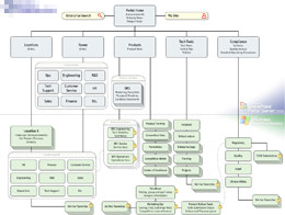
MOSS envisioning engagement

The final site map

I’ve been sent to Los Angeles to help a CTO make a case, in one week, for a MOSS implementation. I approached the process with personas & goals, ethnographic interviews, and a usability-oriented review of their current systems. I also established a good rapport with the CTO, by listening to her business goals and inferring her personal goals. She wanted to shake things up, to streamline the bureaucratic machine while empowering the splinter groups, the internal startups that had developed in a vacuum of control. I can respect the wisdom of that approach, especially when dealing with the potential bureaucratic armageddon that can be unleashed with tools like SharePoint.

I applied my goal-directed approach to navigation, yielding a site map that provided a “Cathedral” area for corporate unity, and local, flexible “Bazaars” for the mavericks. We accommodated the security requirements of the compliance division, putting a key ally in our camp. In one week, we put together a solid plan, and the client invited me to help her present it to her boss.

It was a very quiet, subdued moment, after the chaos of trying to piece together a company in a few days. Just the company’s president, my client, and myself. He appreciated the potential for a healthy balance of corporate types and entrepreneurs, as well as the value of our plan. His questions afterwards were related to the logistics of making it happen. The dialog was productive, good decisions were made.

I head back to Denver, with another feather in my cap. The local sales guy is amazed at how calm our client seems to be. It’s not calm, dude. It’s focus!

Default to Worst Practices

I’m currently taking a training class on K2.Net, a .NET-based workflow system. It’s an interesting tool, quite powerful and usable, and the training is also of high quality. Still, it has me shaking my head, because it teaches worst practices.

The lab section of the training has us building a sample workflow, and it is riddled with bad choices. For a start, the approval step in the workflow is captured by an “Approval” variable which is a string, not a boolean. Okay, that’s minor, and I can see that it makes the lab easier. But then other fields are mis-named, or mis-used, as the lab progresses.

Also, the basic form we build to initiate workflow asks the user for a name and email, even though this is an authenticated, registered user, whose name and email we already know from context.What is worst: We later send notifications to the authenticated user, not to the email address they provided in the form.

It’s like death by a thousand cuts. A slow accumulation of slight design errors and inconsistencies, which eventually amount to the wrong way to design a workflow. Okay, I understand that the training is not about workflow best practices… But shouldn’t it be?

The way I see it, this training will result in a dozen people having the ability to use this product, but no idea how to do it right. Builders with a flawed approach to design. And I see the same problem cropping up everywhere. For instance, on a recent article about Atlas (Microsoft’s upcoming implementation of AJAX), a sample showed how to dynamically change the label on a form button to the current time, when the user clicks it. With Atlas, you can do it without a page refresh. Yeah, but WHY? Why would you ever want to put the current date and time on a button label? I know this is a technology demo, but why demonstrate how to do the wrong thing?

This problem is pervasive in developer training, code samples, programming classes. Developers, who often end up having to make design decisions without extensive training in interaction design, get bombarded with examples of bad design. Why do we keep training bad habits into them?