Holiday Usability Tips

Holiday Usability Tips:
1. Use a “one-click” switch for all your holiday lights.
2. Gifts should be no more than two layers deep from the  wrapping paper.
3. • Make your greeting cards shorter, • highlight key words in bold, and • use bulleted lists.
4. If writing a long letter, don’t use a roll of parchment (Don’t make Santa scroll.)
5.  Label stockings clearly, and sort them by size. Provide a naughty/nice filter.
6. Remember to include a call to action in holiday cards, such as “Have a great holiday!”
7. Keep the menorah down to 5-7 candles, to fit the user’s short-term memory capacity.
8. Offer an automated mass-email of goodwill to all mankind.
9. Color-code fun things in red, happy things in green.
10. When in doubt, just copy Apple.
1. Use a “one-click” switch for all your holiday lights.

2. Gifts should be no more than two layers deep from the wrapping paper.

3. • Make your greeting cards shorter, • highlight key words in bold, and • use bulleted lists.

4. If writing a long letter, don’t use a roll of parchment (Don’t make Santa scroll.)

5.  Label stockings clearly, and sort them by size. Provide a naughty/nice filter.

6. Remember to include a call to action in holiday cards, such as “Have a great holiday!”

7. Keep the menorah down to 5-7 candles, to fit the user’s short-term memory capacity.

8. Offer an automated mass-email of goodwill to all mankind.

9. Color-code fun things in red, happy things in green.

10. When in doubt, just copy Apple.

Novus Biologicals is Live!

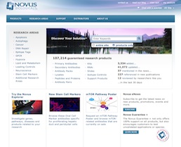
The Novus Biologicals website homepageRocket surgery has nothing on immunobiology and proteomics. With over 100,000 products, in a dozen categories, and the most complex set of product attributes and filters I’ve ever had the honor of untangling, the Novus Biological website was a textbook case of Information Architecture challenges. Working for SpireMedia, I took on the task of understanding the incredibly intricate world of antibodies.

It was a long and hard slog, yet we got through the information architecture and wireframes mostly on budget and on time. Beyond organizing and laying out the site, I also helped resolve some thorny data issues, such as how to apply cumulative filters on a dozen variables to a list of 50,000 items. I also helped evaluate, spec and implement the Novus Explorer, a Flash-based relationship browser, which for the first time gives researchers a visual, interactive way to explore the connections between antibodies, proteins, diseases and genes, clicking through to extensive scientific litterature. I dare say that, for a site with a tenth the budget of its main competitor, the new novusbio.com raises the bar.

On a personal note, I also had the pleasure of working again with Scott Osgood, an old friend, colleague and client from my Immedient/INS days, who took on the job of CTO for Novus on the same day that I took on the Information Architecture tasks for Spiremedia. A very happy coincidence indeed!

I’m more than a little proud of the work that went into this site, though of course the real credit goes to the amazing design and Drupal development teams at Spiremedia, who burned even more midnight oil than I did.