Box-shadow is a powerful property in CSS3. It’s more than just for drop-shadows. Think of it as a multi-purpose 3D styling tool. That’s because you can stack multiple drop shadows.
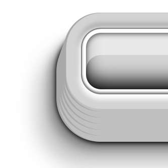
Today I’m going to show you how to make, out of a simple DIV, this:
Box-shadow takes 6 attributes:
- X offset
- Y offset
- Blur size
- Grow/Shrink size (optional)
- Color
- The “inset” flag (optional)
Here are some basic uses of a single box-shadow declaration:
.dropshadow {
    box-shadow: 0px 5px 10px #444;
    }
.fatshadow {
    box-shadow: 0px 5px 10px 5px #444;
    }
.insetshadow {
    box-shadow: 0px 5px 10px #444 inset;
    }
Interesting stuff is possible, for instance, by using no blur, and a semi-transparent white color:
.highlight {
	box-shadow: 0px 1em 0px rgba(255,255,255,0.5) inset;
}
Or, more simply, by using a grow factor on an inset white shadow, without any X or Y offset, we effectively add an inner border.
.innerborder {
	box-shadow: 0px 0px 0px 4px white inset;
}
All of that is fine and dandy, but gets much more interesting when you use multiple box-shadows. You simply separate the declarations with a comma. Each new declaration is painted under the preceding one.
.theworks {
    box-shadow:
/*
gray inset shadow all around,
stronger on the bottom
*/
      0px   -1px    2px         gray inset,
/*
...on top of an inner white band
*/
      0px    0px    0px    3px  white inset,
/*
dark inset shadow under the white band,
stronger on the top (by offsetting it 1
pixel down.
*/
      0px    1px    5px    2px  black inset,
/*
highlight, using semi-transparent white,
without a blur
*/
      0px   15px    0px    3px  rgba(255,255,255,0.5) inset,
/*
Under the highlight, darken the bottom
of the div, with lots of blur
*/
      0px   -8px   15px    0px  black inset,
/*
Done with insets, now on to the outer layers
*/
/*
A white highlight below the div...
*/
      0px    2px    4px    2px  white,
/*
...and a dark recess above.
*/
      0px   -2px    4px    2px  darkgray,
/*
All of it on top of a fat gray outline
*/
      0px    0px    0px   10px  lightgray,
/*
And now some fun. Let's add a lighter
clone to the right, a darker one to the
left, and stack those lower and lower,
and wider and wider. 3D button!
*/
      1px    1px    0px   11px  silver,
     -1px    1px    0px   11px  darkgray,
      1px    4px    0px   12px  silver,
     -1px    4px    0px   12px  darkgray,
      1px    7px    0px   13px  silver,
     -1px    7px    0px   13px  darkgray,
      1px   10px    0px   14px  silver,
     -1px   10px    0px   14px  darkgray,
      1px   13px    0px   15px  silver,
     -1px   13px    0px   15px  darkgray,
      1px   16px    0px   16px  silver,
     -1px   16px    0px   16px  darkgray,
/*
Finally, let's stack three bona-fide
drop-shadows, each lighter, each offset
left.
*/
      0px   16px    4px   17px  black,
     -4px   20px    8px   17px  gray,
    -12px   30px   16px   17px  silver
    ;
}