Will design save Microsoft?

MS ExpressionWell, I’m down in San Francisco for the Microsoft Expression Launch, and I’m intrigued. Not so much by Expression, which is promising, but not yet a slam-dunk, but mostly by the trend that’s developing in Redmond. Microsoft looks like it might be ready to get design.

Now, don’t get me wrong: We’re not there yet. At this point, there’s a lot of schizophrenia in the air. The speakers sound like Microsofties, geeky and technology-focused, but occasionally they say things that were obviously put in their mouths by designers. It’s tentative, it’s hesitant, it’s uncomfortable. I feel for these poor guys, trying to be loyal to the big Redmond machine and creative at the same time, which sounds like an oxymoron. I know their pain first-hand: I’ve been a UX guy in a geek company for five years, and it’s hard to be true to a user-centered philosophy without spitting in the soup. Same for them: They have to skirt the current reality (which is that Microsoft sucks at design) and it’s nerve-wracking. Kind of like being the Chinese minister for human rights, or an EPA official working for the Bush administration. You mean well, but it’s still doubtful that your boss is really committed.

Nonetheless, this is worlds away from what we’re used to seeing from Microsoft. Clearly, there are people there who go get it, and who are trying hard to get the point across. And the exciting part is that if they succeed, they could change the face of the Redmond Machine. I hope the old Microsoft realizes, soon, that It will take more than words, more than pretty graphics, to really get it. It will take a radical change in thinking, a major transformation. And Microsoft’s developer communities, its business and enterprise customer base, and its very own engineers, will likely all have to be brought into the change kicking and screaming.

But UX is the name of the game today. What tech can do doesn’t get anybody excited anymore, not as much as how it does it. Apple gets it. Adobe gets it. The Web 2.0 community gets it. Microsoft is trying to get it. If they do, they might own the next phase of the computer industry as much as they did the last. I’m certainly not sure that they can pull it off, but if they do, it will be very, very good. At this point, we’re still in the middle of the keynote speech, but I’ll be posting more on Expression itself soon. Stay tuned!

Lovable SharePoint Event

Over the last few months, I’ve been making a big splash around town with my latest crazy invention: Lovable Sharepoint. It’s a new service offering, that proposes to take a behemoth of a gas factory, Microsoft Office SharePoint Server, affectionately known as MOSS, and implement it in full-scale, gas-factory enterprise environments… with UX spearheading the effort. 


Title slide for LSP. Image by Peter Alexander.

Title slide for LSP. Image by Peter Alexander.

I’ve put together a presentation, most unlike the typical Microsoft-Gold-Partner Bullet Monster, consisting mostly of one image or word per slide. I’ve worked together a nice 30-minute speech, worked in some blocking and staging, and performed it, first at an INS sponsored event at the Microsoft offices in Denver. We had a full room, while most of these marketing events usually draw about ten people. I had set a single red rose, and my business card, at every seat. Warm breakfast was steaming at some tables in the back. Lights were dimmed a little.


It went very well. My friend Cliff Burton was opening for me, with a review of the MOSS feature set, and he was wonderful, turning this dry subject interesting with his deadpan self-deprecating humor. He rammed through the feature set in twenty minutes, connecting everything to what I would say next. He left the audience awake, in a good mood, and expecting more bullet points and clipart.

Then I went up, and I killed, man! I killed! 

I appealed to the grand vision of freedom and joy: enterprise transformation. I showed pictures of a peace march, and described adoption as a very passive-aggressive form of protest. How can we miss the mark so much, with such great intentions? I showed the tower of Pisa. I stressed that an intranet is a process, not a product, I described the user-driven process, the focus on goals, not tasks. Expanded it to a new vision where top-down and bottom-up feed off each other.

User-driven process, Goal-directed approach, Community focus.

I finished with a plea to approach this work with love. The lights came up and everyone was still awake. They were quite alert too. Hands shot up and I took questions, good pointed questions. Handshakes happened with our sales guys. Cards changed hands. I got some personal thanks and good-jobs. I also got the best set of speaker evaluations to date. And my sales guys were drooling at the leads. In the room were IT and Project managers for a large Christian charity, and I think the “love” message struck a chord.

I love it when that happens. When I can be passionate in a business setting, and the reaction I get. People are starved for authentic genuine passion, in the tech world, but it’s as necessary, if not more, as good requirements and functional specs.

MOSS envisioning engagement

The final site map

I’ve been sent to Los Angeles to help a CTO make a case, in one week, for a MOSS implementation. I approached the process with personas & goals, ethnographic interviews, and a usability-oriented review of their current systems. I also established a good rapport with the CTO, by listening to her business goals and inferring her personal goals. She wanted to shake things up, to streamline the bureaucratic machine while empowering the splinter groups, the internal startups that had developed in a vacuum of control. I can respect the wisdom of that approach, especially when dealing with the potential bureaucratic armageddon that can be unleashed with tools like SharePoint.

I applied my goal-directed approach to navigation, yielding a site map that provided a “Cathedral” area for corporate unity, and local, flexible “Bazaars” for the mavericks. We accommodated the security requirements of the compliance division, putting a key ally in our camp. In one week, we put together a solid plan, and the client invited me to help her present it to her boss.

It was a very quiet, subdued moment, after the chaos of trying to piece together a company in a few days. Just the company’s president, my client, and myself. He appreciated the potential for a healthy balance of corporate types and entrepreneurs, as well as the value of our plan. His questions afterwards were related to the logistics of making it happen. The dialog was productive, good decisions were made.

I head back to Denver, with another feather in my cap. The local sales guy is amazed at how calm our client seems to be. It’s not calm, dude. It’s focus!

Default to Worst Practices

I’m currently taking a training class on K2.Net, a .NET-based workflow system. It’s an interesting tool, quite powerful and usable, and the training is also of high quality. Still, it has me shaking my head, because it teaches worst practices.

The lab section of the training has us building a sample workflow, and it is riddled with bad choices. For a start, the approval step in the workflow is captured by an “Approval” variable which is a string, not a boolean. Okay, that’s minor, and I can see that it makes the lab easier. But then other fields are mis-named, or mis-used, as the lab progresses.

Also, the basic form we build to initiate workflow asks the user for a name and email, even though this is an authenticated, registered user, whose name and email we already know from context.What is worst: We later send notifications to the authenticated user, not to the email address they provided in the form.

It’s like death by a thousand cuts. A slow accumulation of slight design errors and inconsistencies, which eventually amount to the wrong way to design a workflow. Okay, I understand that the training is not about workflow best practices… But shouldn’t it be?

The way I see it, this training will result in a dozen people having the ability to use this product, but no idea how to do it right. Builders with a flawed approach to design. And I see the same problem cropping up everywhere. For instance, on a recent article about Atlas (Microsoft’s upcoming implementation of AJAX), a sample showed how to dynamically change the label on a form button to the current time, when the user clicks it. With Atlas, you can do it without a page refresh. Yeah, but WHY? Why would you ever want to put the current date and time on a button label? I know this is a technology demo, but why demonstrate how to do the wrong thing?

This problem is pervasive in developer training, code samples, programming classes. Developers, who often end up having to make design decisions without extensive training in interaction design, get bombarded with examples of bad design. Why do we keep training bad habits into them?

Extranet with secure webmail

Extranet with SafeMailSometimes all a complex problem needs is a better metaphor.
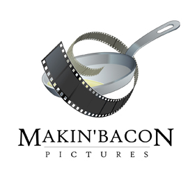
This higher-ed consultancy, client of ours, has been struggling for years with transfers of large data files to and from their clients. Statistical analysis works best on large data sets, and in this case, the files reach in the dozens of megs, and they usually are burnt on CDs and sent in the mail.

Some more courageous institutions had been uploading files through a web interface, but that was fraught with problems, mostly with dropped connections and uploads. Also, there was a lot of back-and-forth on the phone with clients, trying to determine which uploaded file was which, which was outdated, which had changed.

We had finally come up with a semi-reliable way to allow web upload, and decided to revisit the whole user experience before we implemented it. The developers had a clear vision of an online file manager, but I insisted we look at the actors, context, and goals.

It turns out that these files are always exchanged in the context of customer service, always accompanied with conversation and clarifications. And there is a better metaphor for this kind of file exchange: Email attachments.

I proposed a prototype of “Safe Mail”, a new set of pages on the extranet where clients can check their mailbox for messages and announcements, send messages with secure multi-meg attachments, and keep track of the entire process. I made sure to include thumbnail photos of the client’s consultants with their email, and to demo an announcement from the big boss, to highlight the customer service, marketing and sales value of this relational tool. 

The client loved it. The entire office has been abuzz about it since the demo, and the developers are working hard to make it real. It’s going to simplify a whole lot of things around here, and everybody’s very busy trying to find the right photo to use on their profile.

I love it when looking at context and personal goals allows for a complete mind-shift into a better metaphor. We’ve done more than solve an issue here; we’ve changed the nature and tenor of customer service, making it both more rational and more personal.

Hello operator!

Finished another one of my “deus ex machina” one-week fix-it-all stints, this time at the offices of a large cable operator. As usual, this was a SharePoint project, attempting to find some value to deliver to the operations. More specifically, a way to connect the distribution hubs of Video-on-Demand services, with coordinated schedules.

After a half-day being walked through the technical requirements, and attending meetings that were more about politics than tech, I finally asked my team: “Where are the users?”

We descended out of cubicle land and into the depths of Ops, which looked like the interior of the death star. Hallways made of server racks. Finally to a dark room where a few operators sat at a large console, consulting giant screens plastered on the walls, beaming Video-On-Demand by satellite to the four corners of the country. And I spotted the current solution: an excel spreadsheet, prominently displayed on one of the bigger screens, that one of the operators was busy hand-editing.

It turns out, of course, that the users weren’t directly using the current system. They were copy-pasting from it into a master Excel spreadsheet, basically a glorified list. Then, a few times every day, one of them would copy-paste out each hub’s portion of the master sheet, and send each hub their own version of the spreadsheet. It was constant manual labor, yet still outdated every few hours. But it worked better then trying to tease out the relevant info from the cumbersome legacy system.

Once more, a little ethnographic research saved the day. I pointed out the low-tech, instantly usable solution: Import their master spreadsheet into SharePoint. Allow them to mark different rows for different hubs, and have SharePoint automatically replicate this into each hub’s team site. Total time to code and test: 2 days. And the users loved it. We walked back down into the death star, showed it to them, and they had it on the big screen in ten minutes.

The solution was so elegant and simple that I even had time left, the last day of the week, to put together and deliver a little training session at one of the hubs, for the other users of the system. They were shocked and delighted that someone came to see them, with a solution instead of questions, and even more shocked when they realized that I’d just come in out of nowhere and cut their workload down by 20%.

Anytime there’s a SharePoint implementation that has not leveraged any Usability/ User Experience skills, coming in is like shooting fish in a barrel with a bazooka. Too darn easy.

It was a fast-paced week, but the client’s happy, the users are happy, and my boss is happy. I’m going to enjoy the weekend.

Clean and simple…

Clean, clear UI for a questionnaire app.Finished building a nice clean UI for a college counseling questionnaire app. This was an exercise in using CSS to deliver a clear design across browsers, including the dreaded IE 6, with only a couple of days to test and deliver.

White space, use of Lucida Sans Unicode on Windows and Lucida Grande on the Mac, and attention to type spacing and layout made this a winner. The client was delighted, and requested no changes.

Another one in the bag. Moving on…

InnovativeCG is live!

Just finished a quick, bare-bones, low-budget redesign and custom content-management system for Innovative Consulting Group. Another fun little project, using simple “good old” ASP and an MS Access back-end. A little bit of database-driven Flash, as well.

I am starting to really enjoy little low-tech projects like this one. The cutting edge is fun, but sometimes it’s so refreshing to go back in time and slip into some old tried-and-true technologies. It’s like a pair of shoes you haven’t worn in a while: Unfamiliar, yet fitted.

I also love the challenge of delivering superior user experience on a shoestring budget. Applying all the lessons I’ve learned without the frills. The client was also a delight to work with. They knew what they wanted, and how to delegate the rest. A good relationship with one’s client is priceless.

Immedient becomes INS

INS logoWell, it’s nice to move to a bigger, international company, without leaving your desk. Immedient was purchased by INS (International Network Services), a consulting firm with a related, partially overlapping portfolio. INS is big in network and security consulting, and there’s a lot of cross-sell opportunities with Immedient, which is in the IT business services field. Now we can offer the network, the software, and the security all from one shop.

INS is also big, with offices around the world, although it’s not quite a true multinational yet, since the meat of the business is still in the US. Still, I’m allowing myself to dream of a return to Europe again, maybe, someday. In the meantime, for me and my team, it’s business as usual.