Boot Camping at Baxa

Baxa Website thumbnailConducted, with my friend Peter Alexander, a hardcore two-day Usability, Information Architecture and Design Training session for the marketing team at Baxa. Trying to distill everything in two days is always a high-adrenaline challenge, and I think it went very well. The designers at Baxa are a cool team, eager to learn, and I think they picked up imediately on a lot of what we had to offer. 

We had a good chuckle at some of their product names. They manufacture high-quality, reliable, sterile medical equipment like the “3-way oral port stopcock.” There you go, I’ve said it, and my blog is now on every parental-control blacklist!

For Baxa, I also helped lead a Personas-and-Goals exercise, which helped elucidate a lot of debates and clarify the goals for different sections and tools of the site. I also delivered an information architecture review, and a sitemap.

We’re reviewing their next set of comps, and will help them stay on course with spot-checks. I already like what we’re seeing.

The Subgenius Police

Tonight was the last showing of The Subgenius Police, a cyberpunk comedy, written by Don Becker.

What a show! I had the honor of helping out with projections, music, posters and the website. I got to participate closely in the rehearsal process.

This play is unique. First of all, “cyberpunk” is not a term usually associated with theatre. Yet somehow Don managed to carry through the strange “upbeat dystopia” of cyberpunk into live performance. The cast of characters itself is comedy… and Don Becker’s writing is fast and furious, dizzying you with concepts as you laugh, and puzzle, and piss your pants. Don wrote at least two of the characters with specific actors in mind… and most of the cast were not professional actors, but everybody performed beautifully.

I hope that this show will be produced again soon, because I’ll miss it. It was hilarious, beautiful, and exhilarating. After the show, my friend Peter Alexander treated the cast and crew to some live music, with his band The Damn Shambles. We had a little party in the basement where we rehearsed, and rocked out. Turns out that it was The Damn Shambles’ last gig, so it was a double final hurray. What a night!

USA.NET is live!

Thumbnail of new USA.NET websiteToday we released the new USA.NET website, designed by yours truly. I’m pretty happy with it. I initially set the vision for a fully flash-based, dynamic website. Flash today is not a dynamic tool, but using Macromedia’s Generator server, we could theoretically produce a “dynamic offline” site, that could be refreshed as frequently as needed.

We pulled back from that initial vision. We’re releasing a ColdFusion-based website, featuring Flash navigation and enhanced elements. I coded the dynamic update system that queries the database, develops a generation plan for Generator, and builds all 180 navigation panes and page headers in Flash, dynamically, in a few seconds. It also outputs JPGs and imagemaps for older browsers.

The look and feel is also my doing. Professional and modern. Check out the evolution of my design comps. So, not a bad site overall. And I’ve learned some important lessons:

  1. Strong vision leadership is important, and I do this well. I set a direction at the start, and fought hard to see it through. Without that, the site would have quickly devolved into a committee-built frankenstein.
  2. Developers have too much of a chokehold on everything. The clear lines of authority implied by corporate structure mean nothing if developers can put up technical obstacles, without fear of being challenged. It behooves me to keep increasing my technical development skills, to be able to confront them when they’re being short-sighted. Mind you, I understand their plight: The goals they are measured against often run contrary to Marketing’s goals.
  3. There needs to be something else between corporate decision-makers at the top, and designers and developers at the bottom. Regular marketing executives are too far removed from the details of user experience, and too mired in old media, to act as the moderators between designers and developers. Some higher design authority must take charge.

So the need for a Usability Expert is clear, now. I attempted to be that person, but was never granted the authority to do this job. But now I know that that’s the job I want.

TeleTech.com goes Live

Thumbnail of new TeleTech website
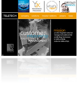
Today we release the new TeleTech website, built entirely in Flash by yours truly. The design is from another designer in the marketing group. It’s got a nice print-media feel, which takes full advantage of the potential of Flash’s vector engine.

The site is ridiculously frugal on bandwidth, delivering a magazine-like experience in a mere 107Kb. See the final comp here. Going flash all the way is a pretty bold move for a big public company… And honestly, it’s not very practical, unless you have a Flash designer on-site, in terms of updates. But in terms of visual differentiation, and a more modern feel, I believe we’ve done something useful.

Kochel.com is Live!

Finished and released the website for Tom Kochel. Tom is an amazing photographer, and a unique personality. He’s been my mentor here at networkMCI, introducing me to photography, and to a different outlook on life. We are very different, but react to the same passions.

Since Tom works mostly in black and white, I decided on a grayscale website, and a simple setup, lean on graphics, to keep the art front and center. I’m proud of the site, and proud to be part of Tom’s fanclub, so I’m keeping a copy of this site on valot.com forever. Take your time looking at it.