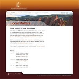
 Max is an old and true friend, and I was delighted to get him set up with a good starter site.
Max is also a keen geek, so I decided against putting a layer of abstraction, such as a CMS or blogging platform, between him and his code. Instead I tried to build good code. I started with a variation on the Blueprint CSS framework, to reset browser styles to a consistent layout, simplify inner-page styling, and get that ever-so-elegant vertical alignment, the “je-ne-sais-quoi” that makes a site look incredibly more pleasant and professional.
The logo is an old friend. It was designed in 1992 by Todd Steigerwald, an amazingly talented designer and illustrator, and close friend to both Max and me. Max has obtained the rights to this logo for his new venture, and it was a treat to get to work with it. I added a bit of light and shadow to it, but kept even the original typeface, which I think still works. We sure enjoyed character stretching in the late eighties and early nineties!
In terms of marketing strategy, we went ahead with “local matters”, since that is Alembic’s stronger differentiator for prospects and new clients, until they get to know Max. A picture of Red Rocks national park would click with our target market, and it gave us a warm, vibrant color scheme, miles away from corporate blue.
In the end, I’ve given Max a clean base to start from. Thanks to Blueprint, the html code stays very light and very discoverable, perfect for hand-editing. And the visual design and brand identity should give him an edge on his drab and messy competition.
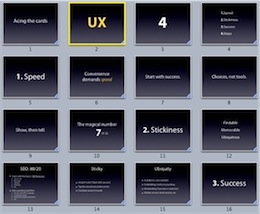 It’s all pretty hush-hush, but this is basically an old media company trying to break into a lucrative new growth market through the web… and I was brought in to assess their efforts.
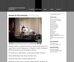

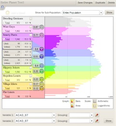 Built a flash-based complex data visualization and stratification tool for a higher education consultancy. The company helps higher ed institutions to recruit and retain students. This tool is aimed at targeting outreach and marketing efforts to the right populations of high-school students, to maximize recruitment success.
 Well, it’s official! After seven years in the consulting business, I’m returning to my roots in the marketing department: I’ve switched positions at
 Delivered a series of Lovable Sharepoint training sessions for Breakthrough Management Group. BMG is an exciting company, that does what I do: Consult on process. They do it mostly with large industrial clients, where a little process can save a lot of money. I was out training their staff on the user-directed approach to SharePoint. We developed Personas and Goals, explored user-centered information architecture, developed an exquisitely goal-oriented site.