 On this day I joined a new company, Immedient, as Information Architect. Immedient is a sizable IT consultancy, headquartered in Denver, with offices accross the country. They’ve been on an acquisition binge, recently, and the HQ is buzzing with activity. Immedient is a new name for the dot-com era. The company was formerly named Raymond James Consulting. I did some freelance graphics work with RJC a few years ago, and thoroughly enjoyed the experience. This is the job I’d been looking for, and that will allow me to truly make a difference. As a graphic designer, I was asked to put lipstick on a pig. As a developer, I was only given enough time and budget to build a pig. My hope is that as an information architect, I’ll get a chance to design a whole different animal. Interestingly, although I found this job on my own, I had to jump through some hoops to get in. That’s because my previous employer, USA.NET, is a client of Immedient, albeit in an area that is totally unrelated to the marketing group I was a part of. Immedient was consulting with USA.NET on their MS Exchange services… So I had to get my boss, the head of marketing, to sign a paper confirming that, in effect, Immedient hadn’t “stolen” me from their client. Kinda funny. It’s a strange position to be in, when you’re telling your manager: “Hey, this is my two-week notice… if you agree to it.” But everybody involved was very professional and things went very smoothly. And I’m happy as a clam in a can. Finally, a chance to shine!
USA.NET is live!
 Today we released the new USA.NET website, designed by yours truly. I’m pretty happy with it. I initially set the vision for a fully flash-based, dynamic website. Flash today is not a dynamic tool, but using Macromedia’s Generator server, we could theoretically produce a “dynamic offline” site, that could be refreshed as frequently as needed.
We pulled back from that initial vision. We’re releasing a ColdFusion-based website, featuring Flash navigation and enhanced elements. I coded the dynamic update system that queries the database, develops a generation plan for Generator, and builds all 180 navigation panes and page headers in Flash, dynamically, in a few seconds. It also outputs JPGs and imagemaps for older browsers.
The look and feel is also my doing. Professional and modern. Check out the evolution of my design comps. So, not a bad site overall. And I’ve learned some important lessons:
- Strong vision leadership is important, and I do this well. I set a direction at the start, and fought hard to see it through. Without that, the site would have quickly devolved into a committee-built frankenstein.
- Developers have too much of a chokehold on everything. The clear lines of authority implied by corporate structure mean nothing if developers can put up technical obstacles, without fear of being challenged. It behooves me to keep increasing my technical development skills, to be able to confront them when they’re being short-sighted. Mind you, I understand their plight: The goals they are measured against often run contrary to Marketing’s goals.
- There needs to be something else between corporate decision-makers at the top, and designers and developers at the bottom. Regular marketing executives are too far removed from the details of user experience, and too mired in old media, to act as the moderators between designers and developers. Some higher design authority must take charge.
So the need for a Usability Expert is clear, now. I attempted to be that person, but was never granted the authority to do this job. But now I know that that’s the job I want.
Hello, dot-com!
 Today I start my new job as Senior Web Developer at USA.NET Just a few weeks ago, I was contacted by my old friend and former boss Kevin Burns. He’s Director of Marketing for USA.NET, and needed something powerful and exciting for their new website. Specifically, he needed me. It’s always nice to be wanted.
USA.NET is a rather large email outsourcing company. Their claim to fame is no less than the invention of webmail, with Net@ddress, years ago. Now services like hotmail.com have popularized the concept, and increased the size of the market, and USA.NET intends to try to maintain its position in that field, but more importantly, it’s banking on outsourcing the entire email chain for its clients.
This is a good lateral career move for me. Having just finished the redesign of the Teletech corporate site into a new Flash envelope, I was ready to undertake something more sizeable. In this new position, I’ll be able to help shape the direction and strategy of the new USA.NET corporate site, as well as produce its new look & feel. Oh yes, there will be flash! I’m excited also to get into ColdFusion development, the staple here at USA.NET. A new feather for my cap!
TeleTech.com goes Live
 Today we release the new TeleTech website, built entirely in Flash by yours truly. The design is from another designer in the marketing group. It’s got a nice print-media feel, which takes full advantage of the potential of Flash’s vector engine.
The site is ridiculously frugal on bandwidth, delivering a magazine-like experience in a mere 107Kb. See the final comp here. Going flash all the way is a pretty bold move for a big public company… And honestly, it’s not very practical, unless you have a Flash designer on-site, in terms of updates. But in terms of visual differentiation, and a more modern feel, I believe we’ve done something useful.
Kochel.com is Live!
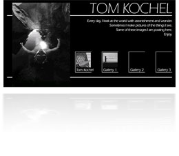
 Finished and released the website for Tom Kochel. Tom is an amazing photographer, and a unique personality. He’s been my mentor here at networkMCI, introducing me to photography, and to a different outlook on life. We are very different, but react to the same passions.
Since Tom works mostly in black and white, I decided on a grayscale website, and a simple setup, lean on graphics, to keep the art front and center. I’m proud of the site, and proud to be part of Tom’s fanclub, so I’m keeping a copy of this site on valot.com forever. Take your time looking at it.