Launching Onceupon.io in private alpha

Onceupon.io

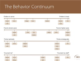
We threw caution to the wind, and built a quick site to test our ideas. Onceupon.io is available only for a limited group of about 80 users, friends of ours, including many writers.

We built it quickly, in a couple of weeks, using Drupal7, a powerful CMS. We’re going to see if we can motivate anyone to write for us. That will be step one.

Novus Biologicals is Live!

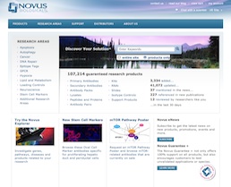
The Novus Biologicals website homepageRocket surgery has nothing on immunobiology and proteomics. With over 100,000 products, in a dozen categories, and the most complex set of product attributes and filters I’ve ever had the honor of untangling, the Novus Biological website was a textbook case of Information Architecture challenges. Working for SpireMedia, I took on the task of understanding the incredibly intricate world of antibodies.

It was a long and hard slog, yet we got through the information architecture and wireframes mostly on budget and on time. Beyond organizing and laying out the site, I also helped resolve some thorny data issues, such as how to apply cumulative filters on a dozen variables to a list of 50,000 items. I also helped evaluate, spec and implement the Novus Explorer, a Flash-based relationship browser, which for the first time gives researchers a visual, interactive way to explore the connections between antibodies, proteins, diseases and genes, clicking through to extensive scientific litterature. I dare say that, for a site with a tenth the budget of its main competitor, the new novusbio.com raises the bar.

On a personal note, I also had the pleasure of working again with Scott Osgood, an old friend, colleague and client from my Immedient/INS days, who took on the job of CTO for Novus on the same day that I took on the Information Architecture tasks for Spiremedia. A very happy coincidence indeed!

I’m more than a little proud of the work that went into this site, though of course the real credit goes to the amazing design and Drupal development teams at Spiremedia, who burned even more midnight oil than I did.

BT DiamondIP is live!

BT DiamondIP WebsiteA whopper of a project!

I was able to set a good direction on the information architecture, and to keep everyone committed to a more-or-less standard navigation scheme. There was little I could do to influence the tone and tenor of the copy, but I did help cut down the marketese to a manageable level. In terms of the visual design and branding, I got to work again with my good friend Peter Alexander, who took in the strict constraints that I was imposing and provided me with just the clean look and photo-graphics I was looking for.

I was committed to building a good modern website, with as little compromise as possible in the quality of the code, design, and trying to stick close to semantic HTML. Noble goals. But I didn’t get a choice in CMS packages. EktronCMS it would be. Ektron is an ASP.NET CMS package with all the features you could want. Smell a rat yet?

It was a constant struggle to get it to work, to get it to work as it should, to get it to work well with clean code. I based the site’s HTML structure on the BluePrint CSS Framework, but that got partially butchered by the junk code ASP.NET wants to inject, and the spaghetti code that Ektron gleefully injects everywhere.

Of course, as a CMS package, Ektron fails as many do: by making GUI editing as complex and counter-intuitive, if not more, than HTML itself. Which means, of course, that the webmaster will have to do the updates anyway… and I could do them faster in Notepad! Also, as a typical ASP.NET application, it breaks all the time. And as a typical enterprise application, it’s also very slow, and ugly as a pig farmer in a cocktail dress.

Nevertheless, I soldiered on through. I used an XML sitemap to drive the navigation dynamically, Ektron collection controls and content placeholders and other god-awful components to put together a site that looks good and doesn’t suck. And custom-coded a bunch of tools and forms. I worked through my Christmas vacation in Paris to get it done. And now it’s done.

I’m proud of the result, yet I can’t say that the process made a lot of sense. I’m an excellent swimmer, but I don’t like to be forced to swim with a backpack full of rocks, especially when nobody needs the rocks or the backpack.
Breaking through at BMGi

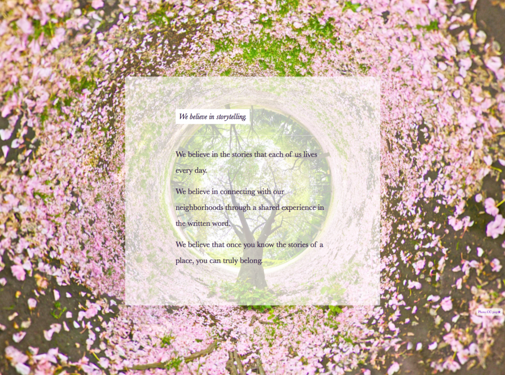
A slide from the BMGi training sessionsDelivered a series of Lovable Sharepoint training sessions for Breakthrough Management Group. BMG is an exciting company, that does what I do: Consult on process. They do it mostly with large industrial clients, where a little process can save a lot of money. I was out training their staff on the user-directed approach to SharePoint. We developed Personas and Goals, explored user-centered information architecture, developed an exquisitely goal-oriented site. 
The message of Lovable SharePoint really hit home at BMGi, where they are acutely aware of the pitfalls of over-engineering. I looked at their resource plan, their scale, and their pressing needs, and basically told them to turn most of SharePoint off, for now. We focused on a high-value, easy-adoption, community-driven approach, and solved some thorny issues with as little new technology as possible.

We had a blast. Over three training sessions, I saw hesitant and overwhelmed team members gain confidence, interest, and more than a glimmer in the eye about the changes we were planning. I left them excited, enthusiastic, and hard at work on this new approach. 

Then I started driving home in the worst snowstorm in over a decade. The one-hour trip from Longmont to Denver turned into eight hours stuck on the freeway. Still, it was a great day!

InnovativeCG is live!

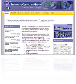
Just finished a quick, bare-bones, low-budget redesign and custom content-management system for Innovative Consulting Group. Another fun little project, using simple “good old” ASP and an MS Access back-end. A little bit of database-driven Flash, as well.

I am starting to really enjoy little low-tech projects like this one. The cutting edge is fun, but sometimes it’s so refreshing to go back in time and slip into some old tried-and-true technologies. It’s like a pair of shoes you haven’t worn in a while: Unfamiliar, yet fitted.

I also love the challenge of delivering superior user experience on a shoestring budget. Applying all the lessons I’ve learned without the frills. The client was also a delight to work with. They knew what they wanted, and how to delegate the rest. A good relationship with one’s client is priceless.