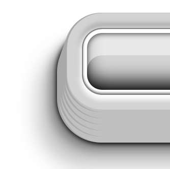
Box-shadow is a powerful property in CSS3. It’s more than just for drop-shadows. Think of it as a multi-purpose 3D styling tool. That’s because you can stack multiple drop shadows.
Today I’m going to show you how to make, out of a simple DIV, this:

Box-shadow is a powerful property in CSS3. It’s more than just for drop-shadows. Think of it as a multi-purpose 3D styling tool. That’s because you can stack multiple drop shadows.
Today I’m going to show you how to make, out of a simple DIV, this:
I’ve been playing with the text-shadow property in CSS3, and having a lot of fun with it. Did you know that modern browsers allow you to stack multiple drop shadows? Used creatively, this allows for all sorts of pure-css fun.
Here’s what we’re going to build today:
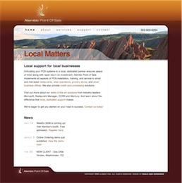 Max is an old and true friend, and I was delighted to get him set up with a good starter site.
Max is also a keen geek, so I decided against putting a layer of abstraction, such as a CMS or blogging platform, between him and his code. Instead I tried to build good code. I started with a variation on the Blueprint CSS framework, to reset browser styles to a consistent layout, simplify inner-page styling, and get that ever-so-elegant vertical alignment, the “je-ne-sais-quoi” that makes a site look incredibly more pleasant and professional.
The logo is an old friend. It was designed in 1992 by Todd Steigerwald, an amazingly talented designer and illustrator, and close friend to both Max and me. Max has obtained the rights to this logo for his new venture, and it was a treat to get to work with it. I added a bit of light and shadow to it, but kept even the original typeface, which I think still works. We sure enjoyed character stretching in the late eighties and early nineties!
In terms of marketing strategy, we went ahead with “local matters”, since that is Alembic’s stronger differentiator for prospects and new clients, until they get to know Max. A picture of Red Rocks national park would click with our target market, and it gave us a warm, vibrant color scheme, miles away from corporate blue.
In the end, I’ve given Max a clean base to start from. Thanks to Blueprint, the html code stays very light and very discoverable, perfect for hand-editing. And the visual design and brand identity should give him an edge on his drab and messy competition.
I was able to set a good direction on the information architecture, and to keep everyone committed to a more-or-less standard navigation scheme. There was little I could do to influence the tone and tenor of the copy, but I did help cut down the marketese to a manageable level. In terms of the visual design and branding, I got to work again with my good friend Peter Alexander, who took in the strict constraints that I was imposing and provided me with just the clean look and photo-graphics I was looking for.
I was committed to building a good modern website, with as little compromise as possible in the quality of the code, design, and trying to stick close to semantic HTML. Noble goals. But I didn’t get a choice in CMS packages. EktronCMS it would be. Ektron is an ASP.NET CMS package with all the features you could want. Smell a rat yet?
It was a constant struggle to get it to work, to get it to work as it should, to get it to work well with clean code. I based the site’s HTML structure on the BluePrint CSS Framework, but that got partially butchered by the junk code ASP.NET wants to inject, and the spaghetti code that Ektron gleefully injects everywhere.
Of course, as a CMS package, Ektron fails as many do: by making GUI editing as complex and counter-intuitive, if not more, than HTML itself. Which means, of course, that the webmaster will have to do the updates anyway… and I could do them faster in Notepad! Also, as a typical ASP.NET application, it breaks all the time. And as a typical enterprise application, it’s also very slow, and ugly as a pig farmer in a cocktail dress.
Nevertheless, I soldiered on through. I used an XML sitemap to drive the navigation dynamically, Ektron collection controls and content placeholders and other god-awful components to put together a site that looks good and doesn’t suck. And custom-coded a bunch of tools and forms. I worked through my Christmas vacation in Paris to get it done. And now it’s done.
I’m proud of the result, yet I can’t say that the process made a lot of sense. I’m an excellent swimmer, but I don’t like to be forced to swim with a backpack full of rocks, especially when nobody needs the rocks or the backpack.
 Sometimes all a complex problem needs is a better metaphor.
This higher-ed consultancy, client of ours, has been struggling for years with transfers of large data files to and from their clients. Statistical analysis works best on large data sets, and in this case, the files reach in the dozens of megs, and they usually are burnt on CDs and sent in the mail.
Some more courageous institutions had been uploading files through a web interface, but that was fraught with problems, mostly with dropped connections and uploads. Also, there was a lot of back-and-forth on the phone with clients, trying to determine which uploaded file was which, which was outdated, which had changed.
We had finally come up with a semi-reliable way to allow web upload, and decided to revisit the whole user experience before we implemented it. The developers had a clear vision of an online file manager, but I insisted we look at the actors, context, and goals.
It turns out that these files are always exchanged in the context of customer service, always accompanied with conversation and clarifications. And there is a better metaphor for this kind of file exchange: Email attachments.
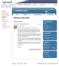
I proposed a prototype of “Safe Mail”, a new set of pages on the extranet where clients can check their mailbox for messages and announcements, send messages with secure multi-meg attachments, and keep track of the entire process. I made sure to include thumbnail photos of the client’s consultants with their email, and to demo an announcement from the big boss, to highlight the customer service, marketing and sales value of this relational tool.
The client loved it. The entire office has been abuzz about it since the demo, and the developers are working hard to make it real. It’s going to simplify a whole lot of things around here, and everybody’s very busy trying to find the right photo to use on their profile.
I love it when looking at context and personal goals allows for a complete mind-shift into a better metaphor. We’ve done more than solve an issue here; we’ve changed the nature and tenor of customer service, making it both more rational and more personal.
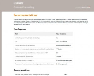 Finished building a nice clean UI for a college counseling questionnaire app. This was an exercise in using CSS to deliver a clear design across browsers, including the dreaded IE 6, with only a couple of days to test and deliver.
White space, use of Lucida Sans Unicode on Windows and Lucida Grande on the Mac, and attention to type spacing and layout made this a winner. The client was delighted, and requested no changes.
Another one in the bag. Moving on…