Novus Biologicals is Live!

The Novus Biologicals website homepageRocket surgery has nothing on immunobiology and proteomics. With over 100,000 products, in a dozen categories, and the most complex set of product attributes and filters I’ve ever had the honor of untangling, the Novus Biological website was a textbook case of Information Architecture challenges. Working for SpireMedia, I took on the task of understanding the incredibly intricate world of antibodies.

It was a long and hard slog, yet we got through the information architecture and wireframes mostly on budget and on time. Beyond organizing and laying out the site, I also helped resolve some thorny data issues, such as how to apply cumulative filters on a dozen variables to a list of 50,000 items. I also helped evaluate, spec and implement the Novus Explorer, a Flash-based relationship browser, which for the first time gives researchers a visual, interactive way to explore the connections between antibodies, proteins, diseases and genes, clicking through to extensive scientific litterature. I dare say that, for a site with a tenth the budget of its main competitor, the new novusbio.com raises the bar.

On a personal note, I also had the pleasure of working again with Scott Osgood, an old friend, colleague and client from my Immedient/INS days, who took on the job of CTO for Novus on the same day that I took on the Information Architecture tasks for Spiremedia. A very happy coincidence indeed!

I’m more than a little proud of the work that went into this site, though of course the real credit goes to the amazing design and Drupal development teams at Spiremedia, who burned even more midnight oil than I did.

BT DiamondIP is live!

BT DiamondIP WebsiteA whopper of a project!

I was able to set a good direction on the information architecture, and to keep everyone committed to a more-or-less standard navigation scheme. There was little I could do to influence the tone and tenor of the copy, but I did help cut down the marketese to a manageable level. In terms of the visual design and branding, I got to work again with my good friend Peter Alexander, who took in the strict constraints that I was imposing and provided me with just the clean look and photo-graphics I was looking for.

I was committed to building a good modern website, with as little compromise as possible in the quality of the code, design, and trying to stick close to semantic HTML. Noble goals. But I didn’t get a choice in CMS packages. EktronCMS it would be. Ektron is an ASP.NET CMS package with all the features you could want. Smell a rat yet?

It was a constant struggle to get it to work, to get it to work as it should, to get it to work well with clean code. I based the site’s HTML structure on the BluePrint CSS Framework, but that got partially butchered by the junk code ASP.NET wants to inject, and the spaghetti code that Ektron gleefully injects everywhere.

Of course, as a CMS package, Ektron fails as many do: by making GUI editing as complex and counter-intuitive, if not more, than HTML itself. Which means, of course, that the webmaster will have to do the updates anyway… and I could do them faster in Notepad! Also, as a typical ASP.NET application, it breaks all the time. And as a typical enterprise application, it’s also very slow, and ugly as a pig farmer in a cocktail dress.

Nevertheless, I soldiered on through. I used an XML sitemap to drive the navigation dynamically, Ektron collection controls and content placeholders and other god-awful components to put together a site that looks good and doesn’t suck. And custom-coded a bunch of tools and forms. I worked through my Christmas vacation in Paris to get it done. And now it’s done.

I’m proud of the result, yet I can’t say that the process made a lot of sense. I’m an excellent swimmer, but I don’t like to be forced to swim with a backpack full of rocks, especially when nobody needs the rocks or the backpack.

Stratification Tool

Thumbnail of the stratification toolBuilt a flash-based complex data visualization and stratification tool for a higher education consultancy. The company helps higher ed institutions to recruit and retain students. This tool is aimed at targeting outreach and marketing efforts to the right populations of high-school students, to maximize recruitment success.
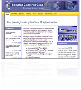
In technical terms, it’s a statistical analysis tool. Likelihood to enroll is calculated for a body of applicants, and the tool gives a visual and interactive interface to the process of dividing that body into sub-groups.

This was a dense app, with lots of complex actionscript. I started with the data, building a visual representation that can be rendered as a histogram or smoothed line chart, with arithmetic or logarithmic scale. The user can then add or remove stratification bands, and set the bounds by sliding a knob along the y-axis. Each band reports its totals and percentages in real-time as the bounds are slid around, allowing the user to quickly create a 50-student band, or a band of 50 likely-to-enroll students.

My main goal was to take a complex decision-making process and make as much of it as possible as intuitive and tactile as possible. I did leverage some of the built-in actionscript animation libraries, using them sparsely and quickly to indicate pliancy of the UI, and give an overall feeling of responsiveness.

This was the most technically dense and complex Flash project I’ve done to date, involving XML/SOAP, handmade graphing routines, GUI design and lots and lots of math. I enjoyed it immensely.

InnovativeCG is live!

Just finished a quick, bare-bones, low-budget redesign and custom content-management system for Innovative Consulting Group. Another fun little project, using simple “good old” ASP and an MS Access back-end. A little bit of database-driven Flash, as well.

I am starting to really enjoy little low-tech projects like this one. The cutting edge is fun, but sometimes it’s so refreshing to go back in time and slip into some old tried-and-true technologies. It’s like a pair of shoes you haven’t worn in a while: Unfamiliar, yet fitted.

I also love the challenge of delivering superior user experience on a shoestring budget. Applying all the lessons I’ve learned without the frills. The client was also a delight to work with. They knew what they wanted, and how to delegate the rest. A good relationship with one’s client is priceless.

Directions and Campus maps for Exempla Healthcare

This is an interesting set of Flash movies. The directions to the hospital are animated, and the campus map features zooming in to the different floors.

Not exactly earth-shaking stuff, but I did try to go a bit past the paper metaphor, and exploit some of the capabilities of animated media. A bigger budget could have made it look more slick, but I don’t mind tight deadlines. Obstacles breed creativity.

Depth of Vision: Isometric Flash 3D for Business Visualization

Thumbnail for Depth Of VisionAhem… Sorry about the overly pompous title on this post… “Depth of Vision”, a flash presentation, is a nice little piece I developed, pretty much on my own, to showcase Immedient’s solution offering. Not much budget behind it: The voice-over talent is my wife!

Isometric 3D is that funny look you’ve seen with pixel art. It’s perspective without depth. I’ve always liked the look of it, even though it’s artificial. I think it’s because even though we never see the world without depth, when we conceive 3D objects, our mind’s eye sees them in an isometric mental model…

This fun little project took less than a week to put together, and was finalized and committee-stamped in less than a week after that. Kept me busy between billing gigs. Enjoy!

The Subgenius Police

Tonight was the last showing of The Subgenius Police, a cyberpunk comedy, written by Don Becker.

What a show! I had the honor of helping out with projections, music, posters and the website. I got to participate closely in the rehearsal process.

This play is unique. First of all, “cyberpunk” is not a term usually associated with theatre. Yet somehow Don managed to carry through the strange “upbeat dystopia” of cyberpunk into live performance. The cast of characters itself is comedy… and Don Becker’s writing is fast and furious, dizzying you with concepts as you laugh, and puzzle, and piss your pants. Don wrote at least two of the characters with specific actors in mind… and most of the cast were not professional actors, but everybody performed beautifully.

I hope that this show will be produced again soon, because I’ll miss it. It was hilarious, beautiful, and exhilarating. After the show, my friend Peter Alexander treated the cast and crew to some live music, with his band The Damn Shambles. We had a little party in the basement where we rehearsed, and rocked out. Turns out that it was The Damn Shambles’ last gig, so it was a double final hurray. What a night!

USA.NET is live!

Thumbnail of new USA.NET website
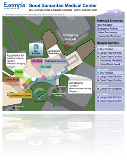
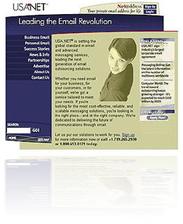
Today we released the new USA.NET website, designed by yours truly. I’m pretty happy with it. I initially set the vision for a fully flash-based, dynamic website. Flash today is not a dynamic tool, but using Macromedia’s Generator server, we could theoretically produce a “dynamic offline” site, that could be refreshed as frequently as needed.

We pulled back from that initial vision. We’re releasing a ColdFusion-based website, featuring Flash navigation and enhanced elements. I coded the dynamic update system that queries the database, develops a generation plan for Generator, and builds all 180 navigation panes and page headers in Flash, dynamically, in a few seconds. It also outputs JPGs and imagemaps for older browsers.

The look and feel is also my doing. Professional and modern. Check out the evolution of my design comps. So, not a bad site overall. And I’ve learned some important lessons:

  1. Strong vision leadership is important, and I do this well. I set a direction at the start, and fought hard to see it through. Without that, the site would have quickly devolved into a committee-built frankenstein.
  2. Developers have too much of a chokehold on everything. The clear lines of authority implied by corporate structure mean nothing if developers can put up technical obstacles, without fear of being challenged. It behooves me to keep increasing my technical development skills, to be able to confront them when they’re being short-sighted. Mind you, I understand their plight: The goals they are measured against often run contrary to Marketing’s goals.
  3. There needs to be something else between corporate decision-makers at the top, and designers and developers at the bottom. Regular marketing executives are too far removed from the details of user experience, and too mired in old media, to act as the moderators between designers and developers. Some higher design authority must take charge.

So the need for a Usability Expert is clear, now. I attempted to be that person, but was never granted the authority to do this job. But now I know that that’s the job I want.

Hello, dot-com!

USA.NET logo, circa 2000Today I start my new job as Senior Web Developer at USA.NET Just a few weeks ago, I was contacted by my old friend and former boss Kevin Burns. He’s Director of Marketing for USA.NET, and needed something powerful and exciting for their new website. Specifically, he needed me. It’s always nice to be wanted.

USA.NET is a rather large email outsourcing company. Their claim to fame is no less than the invention of webmail, with Net@ddress, years ago. Now services like hotmail.com have popularized the concept, and increased the size of the market, and USA.NET intends to try to maintain its position in that field, but more importantly, it’s banking on outsourcing the entire email chain for its clients.

This is a good lateral career move for me. Having just finished the redesign of the Teletech corporate site into a new Flash envelope, I was ready to undertake something more sizeable. In this new position, I’ll be able to help shape the direction and strategy of the new USA.NET corporate site, as well as produce its new look & feel. Oh yes, there will be flash! I’m excited also to get into ColdFusion development, the staple here at USA.NET. A new feather for my cap!