Novus Biologicals is Live!

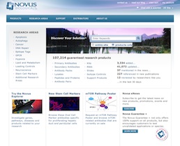
The Novus Biologicals website homepageRocket surgery has nothing on immunobiology and proteomics. With over 100,000 products, in a dozen categories, and the most complex set of product attributes and filters I’ve ever had the honor of untangling, the Novus Biological website was a textbook case of Information Architecture challenges. Working for SpireMedia, I took on the task of understanding the incredibly intricate world of antibodies.

It was a long and hard slog, yet we got through the information architecture and wireframes mostly on budget and on time. Beyond organizing and laying out the site, I also helped resolve some thorny data issues, such as how to apply cumulative filters on a dozen variables to a list of 50,000 items. I also helped evaluate, spec and implement the Novus Explorer, a Flash-based relationship browser, which for the first time gives researchers a visual, interactive way to explore the connections between antibodies, proteins, diseases and genes, clicking through to extensive scientific litterature. I dare say that, for a site with a tenth the budget of its main competitor, the new novusbio.com raises the bar.

On a personal note, I also had the pleasure of working again with Scott Osgood, an old friend, colleague and client from my Immedient/INS days, who took on the job of CTO for Novus on the same day that I took on the Information Architecture tasks for Spiremedia. A very happy coincidence indeed!

I’m more than a little proud of the work that went into this site, though of course the real credit goes to the amazing design and Drupal development teams at Spiremedia, who burned even more midnight oil than I did.
MOSS envisioning engagement

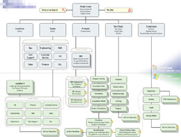
The final site map

I’ve been sent to Los Angeles to help a CTO make a case, in one week, for a MOSS implementation. I approached the process with personas & goals, ethnographic interviews, and a usability-oriented review of their current systems. I also established a good rapport with the CTO, by listening to her business goals and inferring her personal goals. She wanted to shake things up, to streamline the bureaucratic machine while empowering the splinter groups, the internal startups that had developed in a vacuum of control. I can respect the wisdom of that approach, especially when dealing with the potential bureaucratic armageddon that can be unleashed with tools like SharePoint.

I applied my goal-directed approach to navigation, yielding a site map that provided a “Cathedral” area for corporate unity, and local, flexible “Bazaars” for the mavericks. We accommodated the security requirements of the compliance division, putting a key ally in our camp. In one week, we put together a solid plan, and the client invited me to help her present it to her boss.

It was a very quiet, subdued moment, after the chaos of trying to piece together a company in a few days. Just the company’s president, my client, and myself. He appreciated the potential for a healthy balance of corporate types and entrepreneurs, as well as the value of our plan. His questions afterwards were related to the logistics of making it happen. The dialog was productive, good decisions were made.

I head back to Denver, with another feather in my cap. The local sales guy is amazed at how calm our client seems to be. It’s not calm, dude. It’s focus!

Clinical Trials and Tribulations

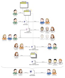
A humanized flow diagramWorked on a whopper of a project, for Microsoft. My company was picked to help develop a “Solution Accelerator” for the Pharmaceuticals industry, providing a SharePoint implementation template for clinical trials, as well as some InfoPath data-gathering tools.

Clinical trials are enormously complex, regulated, and expensive. We focused on the protocol creation and approval process, which contains aspects of collaborative document authoring and workflow, regulatory submission and approval, etc. I had always thought enterprise software projects were big things, but taking a look at clinical trial protocols helped put that in perspective.

The challenge was to learn a lot very fast, in order to be able to add value. In about five weeks, we nailed down the realities of the process of protocol creation and submission, and I insisted we also focus on the context and goals of the different actors and stakeholders. I designed a nifty cast of characters, which we used in process diagrams to make the workflow come to life. They proved unexpectedly useful.

What happened is that the little sketch you see here helped everybody on the team stay on the same page in terms of user functionality. Developers working on a module could see the gal in the white lab coat and glasses using their module, and they made the interface precise and data-rich. UIs were markedly different, more verbose and action-oriented, for the suit-and-tie users.

I created countless flow diagrams, worked closely with developers to ensure all requirements were covered, and designed the SharePoint UI to host and unify it all. On a project of such scale and urgency, the difficulty was to not let user considerations get buried under the colossal weight of enormous and dense requirements. Tensions ran high, but we delivered, and the client was satisfied with the result.