 Worked on a whopper of a project, for Microsoft. My company was picked to help develop a “Solution Accelerator” for the Pharmaceuticals industry, providing a SharePoint implementation template for clinical trials, as well as some InfoPath data-gathering tools.
Clinical trials are enormously complex, regulated, and expensive. We focused on the protocol creation and approval process, which contains aspects of collaborative document authoring and workflow, regulatory submission and approval, etc. I had always thought enterprise software projects were big things, but taking a look at clinical trial protocols helped put that in perspective.
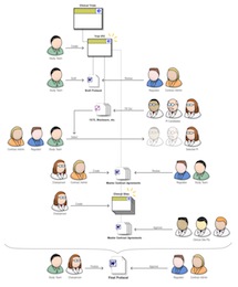
The challenge was to learn a lot very fast, in order to be able to add value. In about five weeks, we nailed down the realities of the process of protocol creation and submission, and I insisted we also focus on the context and goals of the different actors and stakeholders. I designed a nifty cast of characters, which we used in process diagrams to make the workflow come to life. They proved unexpectedly useful.
What happened is that the little sketch you see here helped everybody on the team stay on the same page in terms of user functionality. Developers working on a module could see the gal in the white lab coat and glasses using their module, and they made the interface precise and data-rich. UIs were markedly different, more verbose and action-oriented, for the suit-and-tie users.
I created countless flow diagrams, worked closely with developers to ensure all requirements were covered, and designed the SharePoint UI to host and unify it all. On a project of such scale and urgency, the difficulty was to not let user considerations get buried under the colossal weight of enormous and dense requirements. Tensions ran high, but we delivered, and the client was satisfied with the result.
 Well, it’s nice to move to a bigger, international company, without leaving your desk. Immedient was purchased by INS (International Network Services), a consulting firm with a related, partially overlapping portfolio. INS is big in network and security consulting, and there’s a lot of cross-sell opportunities with Immedient, which is in the IT business services field. Now we can offer the network, the software, and the security all from one shop.
 Worked on a whopper of a project, for Microsoft. My company was picked to help develop a “Solution Accelerator” for the Pharmaceuticals industry, providing a SharePoint implementation template for clinical trials, as well as some InfoPath data-gathering tools.
 Did a one-week stint in Houston, Texas for a large international oil company, helping fix an internal accounting app. As is common with enterprise engagements, we were not only putting together a unified dashboard for a set of disparate and incompatible financial and accounting systems, but also walking the slick tightropes of high-flying politics.
 On this day I joined a new company, Immedient, as Information Architect. Immedient is a sizable IT consultancy, headquartered in Denver, with offices accross the country. They’ve been on an acquisition binge, recently, and the HQ is buzzing with activity. Immedient is a new name for the dot-com era. The company was formerly named Raymond James Consulting. I did some freelance graphics work with RJC a few years ago, and thoroughly enjoyed the experience. This is the job I’d been looking for, and that will allow me to truly make a difference. As a graphic designer, I was asked to put lipstick on a pig. As a developer, I was only given enough time and budget to build a pig. My hope is that as an information architect, I’ll get a chance to design a whole different animal. Interestingly, although I found this job on my own, I had to jump through some hoops to get in. That’s because my previous employer, USA.NET, is a client of Immedient, albeit in an area that is totally unrelated to the marketing group I was a part of. Immedient was consulting with USA.NET on their MS Exchange services… So I had to get my boss, the head of marketing, to sign a paper confirming that, in effect, Immedient hadn’t “stolen” me from their client. Kinda funny. It’s a strange position to be in, when you’re telling your manager: “Hey, this is my two-week notice… if you agree to it.” But everybody involved was very professional and things went very smoothly. And I’m happy as a clam in a can. Finally, a chance to shine!