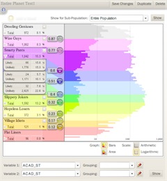
 Built a flash-based complex data visualization and stratification tool for a higher education consultancy. The company helps higher ed institutions to recruit and retain students. This tool is aimed at targeting outreach and marketing efforts to the right populations of high-school students, to maximize recruitment success.
In technical terms, it’s a statistical analysis tool. Likelihood to enroll is calculated for a body of applicants, and the tool gives a visual and interactive interface to the process of dividing that body into sub-groups.
This was a dense app, with lots of complex actionscript. I started with the data, building a visual representation that can be rendered as a histogram or smoothed line chart, with arithmetic or logarithmic scale. The user can then add or remove stratification bands, and set the bounds by sliding a knob along the y-axis. Each band reports its totals and percentages in real-time as the bounds are slid around, allowing the user to quickly create a 50-student band, or a band of 50 likely-to-enroll students.
My main goal was to take a complex decision-making process and make as much of it as possible as intuitive and tactile as possible. I did leverage some of the built-in actionscript animation libraries, using them sparsely and quickly to indicate pliancy of the UI, and give an overall feeling of responsiveness.
This was the most technically dense and complex Flash project I’ve done to date, involving XML/SOAP, handmade graphing routines, GUI design and lots and lots of math. I enjoyed it immensely.